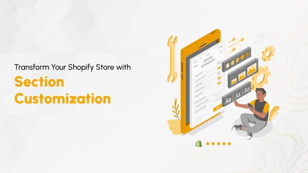
I remember the first time I realized how powerful Shopify sections were, not because they made development easier, but because they reduced friction between developers and merchants. Section customization is not just about design flexibility; it is about structured control over layout, content, and user experience without constant code changes.
Shopify sections allow store owners to modify storefront layouts through configurable Liquid components. This architecture enables reusable, scalable design systems while preserving theme integrity.
In this guide, I explain how to create custom Shopify sections properly, why schema design matters, and how structured customization improves long-term maintainability.
Power of Shopify Sections
Shopify sections are modular Liquid files that define reusable UI components. They separate structure, styling, and configuration, allowing merchants to customize layouts through schema-driven inputs instead of direct code edits.
Understanding Liquid and schema architecture ensures sections remain scalable, reusable, and performance-friendly. Let us get familiar with Liquid, and of course, let’s create an image banner to demonstrate how useful Shopify sections are in terms of customizing the Shopify storefront.
How to Create Custom Sections in Shopify
Creating custom sections requires structured thinking. A well-designed section balances flexibility for merchants with clean architecture for developers. Below is the practical implementation process, from duplication safeguards to schema configuration.

The Shopify sections have mainly four components
- CSS styles,
- Liquid code,
- some javascript code (if required),
- schema for the customizable inputs.
Note*- before making any changes it's recommended to create a duplicate theme to test your modifications before publishing it live. Shopify admin -> Online Store -> themes -> click on the three dots beside the customize button on the theme you want to make a copy of -> click on the duplicate theme. Otherwise, if anything breaks you will be in a problematic situation
1. Click on three dots next to the customize button on a theme then select edit code.
2. Now, let's take action and make your website shine! Head over to the sections folder on the left sidebar of your Shopify dashboard. Exciting, right? Click on it to expand the options, and then feel the thrill as you select "Add a new section." This is where the magic begins – you can unleash your creativity and bring your vision to life!
3. A pop-up will appear in which select the type as liquid section, enter a name for the section, and click on done.
4. Write the required code for the functionalities of the banner section.
- CSS styles
<style>
  div:empty.banner__overlay{
    display: block;
  }
  .banner__container{
    width: 100%;
    position: relative;
  }
  .banner__overlay{
    width: 100%;
    height: 100%;
    position: absolute;
    top: 0;
    left: 0;
    z-index: 9
  }
  .banner__image{
    width: 100%;
    height: 100%;
  }
  .banner__image img{
    width: 100%;
    object-fit: cover;
  }
  .banner__overlay--text{
    width: 100%;
    height: 100%;
    position: absolute;
    top: 0;
    left: 0;
    z-index: 10;
    display: flex;
  }
  .overlay__text--content{
    display: flex;
    flex-direction: column;
    gap: 1rem;
  }
  .banner__overlay--text a{
    text-decoration: none;
  }
  @media screen and (max-width: 578px){
    .banner__container{
      height: auto !important;
    }
  }
</style>
- Liquid code
<div class="banner__container" style="height: {{ section.settings.height }}vh;">
  <div class="banner__overlay" style="background: rgba(0,0,0,{{ section.settings.opacity }}); display: {% if section.settings.isVisible %} block {% else %} none {% endif %}"></div>
  <div class="banner__image">
    <img src="{{ section.settings.banner_image | img_url: '1000x1000' }}" width="" height=""/>
  </div>
  <div class="banner__overlay--text" style="justify-content:{% if section.settings.h_align == "left" %}flex-start
        {% elsif section.settings.h_align == "right"%}flex-end{% else %}center{% endif %};
    align-items:{% if section.settings.v_align == "top" %}flex-start
    {% elsif section.settings.v_align == "bottom" %}flex-end{% else %}center{% endif %}; display: {% if section.settings.isVisible %} flex {% else %} none {% endif %}">

    <div class="overlay__text--content" style="align-items:{% if section.settings.text_v_align == "left" %}flex-start
    {% elsif section.settings.text_v_align == "right" %}flex-end{% else %}center{% endif %}; display: {% if section.settings.isVisible %} flex {% else %} none {% endif %}">
        <h1 style="color:{{ section.settings.content_text_color }}; font-size: {{ section.settings.heading_font_size }};">{{ section.settings.heading_text }}</h1>
        <p style="color: {{ section.settings.content_text_color }}; font-size: {{ section.settings.subheading_font_size }};">{{ section.settings.subheading_text }}</p>
        <a href="{{ section.settings.btn_url }}" style="color: {{ section.settings.btn_text_color }};
          background: {{ section.settings.btn_background }};
          font-size:{{ section.settings.btn_font_size }}px;
          padding: {{ section.settings.btn_padding_v }}px {{ section.settings.btn_padding_h }}px;">{{ section.settings.btn_text1 }}</a>
    </div>
  </div>
  </div>
1. Javascript code, in this case, we don’t have it, however, if you want to add some functionalities that require javascript logic then you can go ahead and add them.
Your Store, Open for Business - Fast
Custom Shopify builds that convert browsers into buyers.
2. Input schema: This JSON object represents the customization settings for the clients or merchants. The schema has the following properties.
{% schema %}
{
“name”: “Section name”,
“settings”: [
	//This object contains an array of setting input objects
	// object 1
{
	“type”: “type of input ”,
	“id”: “a unique string to identify the value of this input”,
	“label”: “ the text that will show up as a label of input in the customization settings”,
	“default”: “the default value of the input”
}
//object 2
{
	“type”: “ ”,
	“id”: “ ”,
	“label”: “ ”,
	“default”: “ ”
}
………..
// object n
{
	“type”: “ ”,
	“id”: “ ”,
	“label”: “ ”,
	“default”: “ ”
}
],
“presets”:[
	// Presets are default configurations of sections that enable users to easily add a section to a JSON template through the theme editor. Presets aren't related to theme styles that are defined in settings_data.json.
	{
	“name”: ”Section Name (this name should be similar to the value of name property of the schema)”,

}
]
}
Explore more https://shopify.dev/docs/themes/architecture/sections
Here is the schema for our banner section example,
{% schema %}
  {
    "name": "Banner",
    "settings": [
      {
        "type": "image_picker",
        "id": "banner_image",
        "label": "Image"
      },

      {
        "type": "range",
        "id": "height",
        "min": 30,
        "max": 100,
        "step": 5,
        "default": 80,
        "unit": "vh",
        "label": "Banner Height"
      },
      {
        "type": "checkbox",
        "id": "isVisible",
        "label": "Show Overlay",
        "default": false
      },
      {
        "type": "header",
        "content": "Overlay Content"
      },
      {
        "type": "range",
        "id": "opacity",
        "min": 0,
        "max": 1,
        "step": 0.1,
        "default": 0.2,
        "label": "Banner Overlay Opacity"
      },
      {
      "type": "select",
      "id": "v_align",
      "options": [
        {
          "value": "top",
          "label": "top"
        },
        {
          "value": "center",
          "label": "center"
        },
        {
          "value": "bottom",
          "label": "bottom"
        }
      ],
      "default": "center",
      "label": "Vertical Alignment"
    },
    {
      "type": "select",
      "id": "h_align",
      "options": [
        {
          "value": "left",
          "label": "left"
        },
        {
          "value": "center",
          "label": "center"
        },
        {
          "value": "right",
          "label": "right"
        }
      ],
      "default": "center",
      "label": "Horizontal Alignment"
    },
      {
      "type": "select",
      "id": "text_v_align",
      "options": [
        {
          "value": "left",
          "label": "left"
        },
        {
          "value": "center",
          "label": "center"
        },
        {
          "value": "right",
          "label": "right"
        }
      ],
      "default": "center",
      "label": "Overlay Content Alignment"
    },
      {
        "type": "text",
        "id": "heading_text",
        "label": "Heading Text",
        "default": "Heading"
      },
      {
         "type": "range",
        "id": "heading_font_size",
        "min": 10,
        "max": 50,
        "step": 1,
        "default": 24,
        "unit": "px",
        "label": "Heading Font Size"
      },
      {
        "type": "text",
        "id": "subheading_text",
        "label": "Subheading Text",
        "default": "Subheading"
      },
      {
         "type": "range",
        "id": "subheading_font_size",
        "min": 10,
        "max": 30,
        "step": 1,
        "default": 16,
        "unit": "px",
        "label": "Subheading Font Size"
      },
      {
        "type": "color",
        "id": "content_text_color",
        "label": "Content Text Color",
        "default": "#fff"
      },
      {
        "type": "text",
        "id": "btn_text1",
        "label": "Button Text",
        "default": "Shop Now"
      },
      {
        "type": "url",
        "id": "btn_url",
        "label": "Button Url"
      },
      {
        "type": "range",
        "id": "btn_font_size",
        "min": 10,
        "max": 30,
        "step": 1,
        "default": 16,
        "unit": "px",
        "label": "Button Font Size"
      },
      {
        "type": "range",
        "id": "btn_padding_h",
        "min": 10,
        "max": 30,
        "step": 1,
        "default": 10,
        "unit": "px",
        "label": "Button Padding Horizontal"
      },
      {
        "type": "range",
        "id": "btn_padding_v",
        "min": 10,
        "max": 30,
        "step": 1,
        "default": 10,
        "unit": "px",
        "label": "Button Padding vertical"
      },
      {
        "type": "color",
        "id": "btn_text_color",
        "label": "Button Text",
        "default": "#fff"
      },
      {
        "type": "color",
        "id": "btn_background",
        "label": "Button Background",
        "default": "transparent"
      }
    ],
    "presets": [
      {
        "name": "Banner"
      }
    ]
  }
{% endschema %}
5. Save the code and let’s head toward theme customization. In the customization panel on the left sidebar under Template scroll till the end and you will be able to see an add section option click on it which will open a pop-up with a search option for sections, enter the name of the section (in this case the name of the section we created is Banner).
6. Select the section from the suggested sections and the banner section will be added to the page. Now click and hold on to the section drag it upwards and leave it wherever you want to place it on the page.
7. Click on the banner section on the left sidebar to see the customization settings.
8. Let's try adding an image by clicking on the select image button on the left sidebar.
https://www.loom.com/share/ad3cf033698240f5a4ee21659f1edb21?sid=b283da3e-cf0f-4137-8c1a-798d6e89fa67
9. Adjust the height of the banner.
https://www.loom.com/share/5b72e46673d94e248c0bac0c9b90dd84?sid=4f2e694c-15c9-4946-b122-e19902f60df9
10. We have a show overlay check box, when the checkbox is checked we will be able to see the contents like heading subheadings and buttons on the banner.
https://www.loom.com/share/23c77abf0f5449b5896ef076eea1bc96?sid=4653093e-ff1d-452b-9d26-bc0dd06a82e5
11. Modifying the heading and subheadings of the banner content.
https://www.loom.com/share/ca48a68eef054a10848e74da4a12fd68?sid=0683c2ab-3561-4fd9-a0d0-53471682ac13
12. Modifying button appearances, URL, and text.
https://www.loom.com/share/1e554b709d6c40ac940803134e082dbb?sid=59fd7b7e-fdc8-4ac5-b3f8-fa81c290f3d2
13. Modifying the overlay opacity and positioning of the content on the overlay.
https://www.loom.com/share/c567afcd305f498dac8ba14acafc78d6?sid=4ccbaf24-e82d-42a3-a30e-0092275e108f
As demonstrated above, Shopify sections provide full control over layout customization while preserving theme stability. Structured schema configuration ensures merchants can modify content, alignment, and styling without breaking core architecture. It’s easy to manage even for non-coders, like most clients or merchants.
Did you know? You can also explore how to enhance your website's dynamic elements by learning about Dynamic Open Graph Images in Next.js. It's an insightful read for anyone looking to elevate their site's social sharing capabilities.
Advantages of Section Customization
Section customization delivers operational and technical advantages for both developers and merchants:
User-Friendly Interface: As we have seen, making any customization to the sections doesn’t require technical expertise; even a non-technical person can do the modifications. The visual editor makes it so interactive for the users that they can see the preview in real-time.
Flexibility and Adaptability: The developer can adapt the store's layout styling. Update, seasonal promotions, banners, and other modifications become a cakewalk for the merchants.
Your Store, Open for Business - Fast
Custom Shopify builds that convert browsers into buyers.
Consistent Branding: Maintain a cohesive visual identity effortlessly by customizing headers, footers, and more. Consistency in branding contributes to a polished and professional online presence.
Reusability: Creating sections makes it easy to insert similar-looking sections across various pages without having to duplicate mode (which would otherwise make it a maintenance nightmare)
Frequently Asked Questions
1. What are Shopify sections?
Shopify sections are modular Liquid components that allow customizable storefront layouts through schema-based inputs.
2. Do Shopify sections require coding knowledge?
Creating custom sections requires Liquid knowledge, but merchants can modify them visually without coding.
3. What is the role of schema in Shopify sections?
Schema defines customizable inputs such as text, images, alignment, and styling options available in the theme editor.
4. Why should I duplicate a theme before editing sections?
Duplicating a theme prevents live storefront issues during development or testing.
5. Are Shopify sections reusable across pages?
Yes. Sections are modular and can be reused across templates for consistent branding and easier maintenance.
Conclusion:
Shopify sections transform theme customization from ad-hoc edits into structured configuration. By leveraging Liquid, schema inputs, and modular architecture, developers create scalable storefront systems that merchants can manage independently.
Effective section design improves maintainability, reduces deployment risk, and enhances user experience consistency across the storefront.
Shopify sections aren't just tools – they're about giving power to both developers and clients. They make working together easier and let everyone create a website representing them.

Amarnath Barpanda
Experienced Frontend Developer with a coder's heart. Mastering Shopify intricacies, crafting seamless shopping experiences. Let's elevate the e-commerce game. 🚀🌟