- Define light and dark
ThemeData objects.- Use
ColorScheme.fromSeed to generate coordinated Material 3 colors.- Pass both themes to
MaterialApp.- Control the active theme using
ThemeMode.- Offer System, Light, and Dark options instead of only a boolean switch.
- Store the selected mode with
SharedPreferencesAsync.- Restore the preference before calling
runApp to avoid a visible theme flash.- Use
Theme.of(context) instead of hardcoded widget colors.- Test text, forms, dialogs, images, and disabled states in both modes.
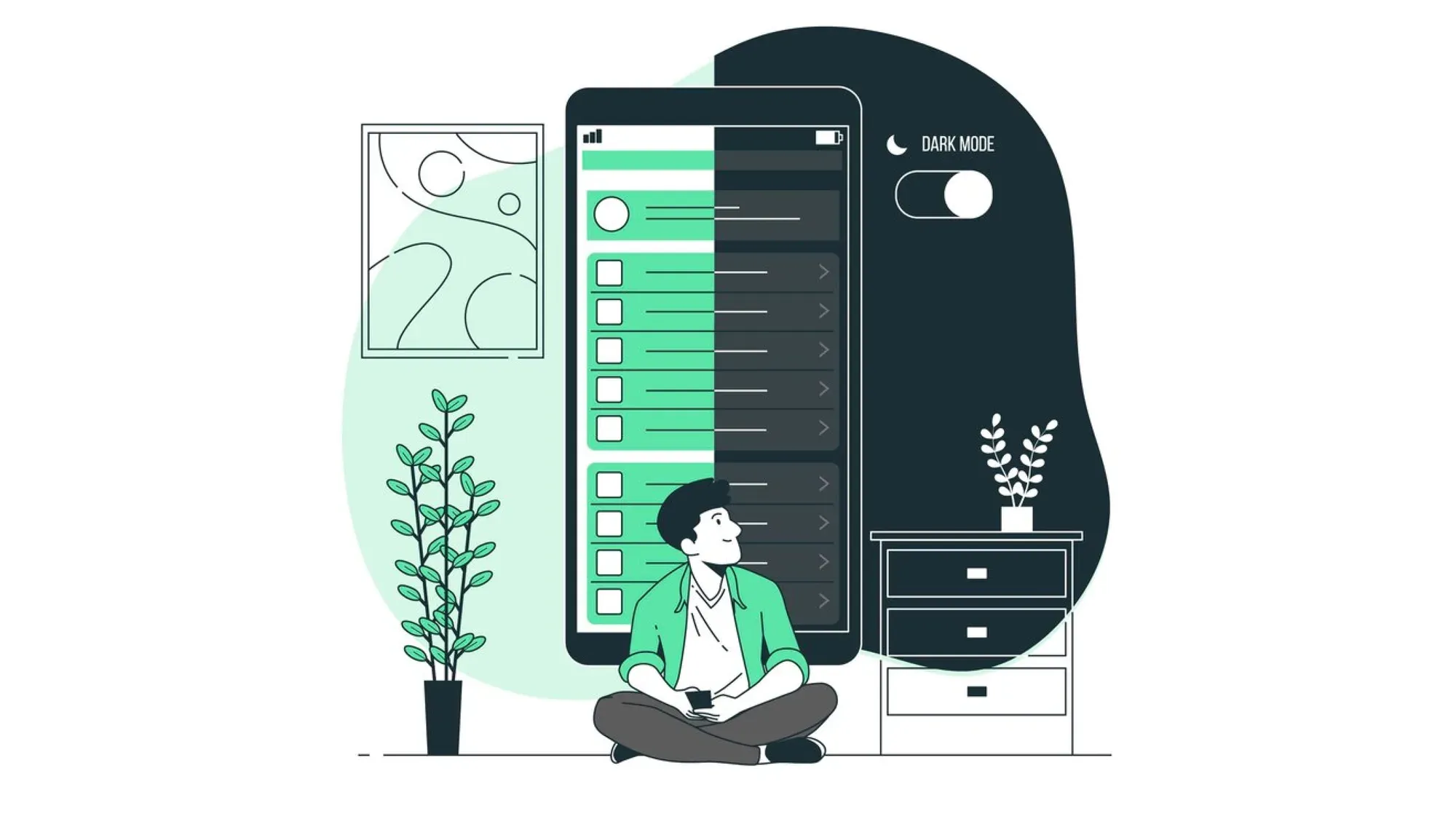
Dark mode in Flutter is easy to demonstrate but surprisingly easy to implement poorly. Changing the background to black is not enough; the app bar, cards, dialogs, text, icons, input fields, and system preferences all need to behave consistently.
A complete implementation should also remember the user’s choice after the app closes. In this guide, we will create light and dark themes, follow the device theme by default, add a manual selector, and persist the selection without introducing a separate state-management package.
How Flutter Dark Mode Works
Flutter dark mode is controlled through three MaterialApp properties:
MaterialApp(
  theme: lightTheme,
  darkTheme: darkTheme,
  themeMode: ThemeMode.system,
)themedefines the light appearance.darkThemedefines the dark appearance.themeModedetermines which theme Flutter applies.
ThemeMode supports three values:
| Value | Behaviour |
ThemeMode.system | Follows the device’s appearance setting |
ThemeMode.light | Always uses the light theme |
ThemeMode.dark | Always uses the dark theme |
When ThemeMode.system is active, Flutter listens to the platform brightness and switches themes when the operating-system preference changes.
Why Dark Mode Matters?
Dark mode gives users control over how an application appears in different environments. It is particularly useful at night or in interfaces that users keep open for extended periods.
On OLED displays, darker pixels may consume less power because individual pixels produce their own light. The actual battery benefit depends on the display, brightness level, color palette, and how much of the screen is dark.
Dark mode also helps an app feel consistent with Android and iOS. If a user has selected a system-wide appearance, an app that suddenly displays a bright interface can feel disconnected from the rest of the device.
However, dark mode is not automatically more accessible. Poor contrast, muted error states, invisible icons, and pure-white text on a harsh black background can make a dark interface harder to use.
Step 1: Add Preference Storage
Flutter does not automatically save a manually selected theme. Add shared_preferences:
flutter pub add shared_preferencesRun:
flutter pub getThe package now provides three APIs:
SharedPreferencesSharedPreferencesAsyncSharedPreferencesWithCache
The original SharedPreferences API is considered legacy for new implementations. This guide usesSharedPreferencesAsync, which always reads from the platform store instead of relying on an in-memory cache.
A theme preference is an appropriate use case because it is simple, non-sensitive application data. Do not use shared preferences for passwords, access tokens, payment information, or other secrets.
Step 2: Define Light and Dark Themes
Create lib/app_theme.dart:
import 'package:flutter/material.dart';

class AppTheme {
  AppTheme._();

  static final ThemeData light = ThemeData(
    useMaterial3: true,
    colorScheme: ColorScheme.fromSeed(
      seedColor: Colors.indigo,
      brightness: Brightness.light,
    ),
    inputDecorationTheme: const InputDecorationTheme(
      border: OutlineInputBorder(),
    ),
  );

  static final ThemeData dark = ThemeData(
    useMaterial3: true,
    colorScheme: ColorScheme.fromSeed(
      seedColor: Colors.indigo,
      brightness: Brightness.dark,
    ),
    inputDecorationTheme: const InputDecorationTheme(
      border: OutlineInputBorder(),
    ),
  );
}
ColorScheme.fromSeed creates coordinated colors for both brightness modes. Material widgets can then select suitable background, foreground, container, and contrast colors from the generated scheme.
This is safer than manually setting only primaryColor and a background color. A complete Material interface uses multiple color roles, including:
colorScheme.primary
colorScheme.onPrimary
colorScheme.surface
colorScheme.onSurface
colorScheme.error
colorScheme.onError
colorScheme.primaryContainer
colorScheme.onPrimaryContainer
The on colors represent content displayed on top of another color. For example, onPrimary should remain readable when displayed over primary.
Step 3: Create a Theme Controller
Create lib/theme_controller.dart:
import 'package:flutter/material.dart';
import 'package:shared_preferences/shared_preferences.dart';

class ThemeController extends ChangeNotifier {
  ThemeController(this._preferences);

  static const String _themeKey = 'theme_mode';

  final SharedPreferencesAsync _preferences;

  ThemeMode _themeMode = ThemeMode.system;

  ThemeMode get themeMode => _themeMode;

  Future<void> load() async {
    final savedMode =
        await _preferences.getString(_themeKey);

    _themeMode = switch (savedMode) {
      'light' => ThemeMode.light,
      'dark' => ThemeMode.dark,
      _ => ThemeMode.system,
    };
  }

  Future<void> setThemeMode(ThemeMode mode) async {
    if (_themeMode == mode) return;

    _themeMode = mode;
    notifyListeners();

    await _preferences.setString(
      _themeKey,
      mode.name,
    );
  }
}
This controller has three responsibilities:
- Store the currently selected
ThemeMode. - Notify Flutter when the theme changes.
- Save and restore the selection.
The default is ThemeMode.system, so first-time users automatically receive the appearance selected in their device settings.
Saving mode.name stores one of three strings:
system
light
dark
This is better than saving a boolean such as isDarkMode. A boolean cannot represent the third option: following the system.
Step 4: Restore the Theme Before Starting the App
Update lib/main.dart:
import 'package:flutter/material.dart';
import 'package:shared_preferences/shared_preferences.dart';

import 'app_theme.dart';
import 'theme_controller.dart';

Future<void> main() async {
  WidgetsFlutterBinding.ensureInitialized();

  final themeController = ThemeController(
    SharedPreferencesAsync(),
  );

  await themeController.load();

  runApp(
    MyApp(themeController: themeController),
  );
}

class MyApp extends StatelessWidget {
  const MyApp({
    super.key,
    required this.themeController,
  });

  final ThemeController themeController;

  @override
  Widget build(BuildContext context) {
    return AnimatedBuilder(
      animation: themeController,
      builder: (context, child) {
        return MaterialApp(
          debugShowCheckedModeBanner: false,
          title: 'Flutter Dark Mode',
          theme: AppTheme.light,
          darkTheme: AppTheme.dark,
          themeMode: themeController.themeMode,
          home: HomeScreen(
            themeController: themeController,
          ),
        );
      },
    );
  }
}
Loading the preference before runApp prevents the application from briefly displaying its default theme before switching to the saved one.
The controller extends ChangeNotifier, so AnimatedBuilder rebuilds MaterialApp whenever notifyListeners() runs. Flutter then applies the selected theme throughout the widget tree.
No Provider, Riverpod, or BLoC dependency is required for this small example. In an existing application, the same controller can be integrated with whichever state-management approach the project already uses.
Step 5: Add a Theme Selector
A simple dark-mode switch can only represent light and dark. If the app should also follow the system, provide all three options.
Let’s Build Your Flutter App Together!
Work with our expert team to turn your app idea into a fast, stunning Flutter product.
Add this screen to main.dart:
class HomeScreen extends StatelessWidget {
  const HomeScreen({
    super.key,
    required this.themeController,
  });

  final ThemeController themeController;

  @override
  Widget build(BuildContext context) {
    final colors = Theme.of(context).colorScheme;

    return Scaffold(
      appBar: AppBar(
        title: const Text('Appearance'),
      ),
      body: ListView(
        padding: const EdgeInsets.all(16),
        children: [
          Text(
            'Choose a theme',
            style: Theme.of(context)
                .textTheme
                .headlineSmall,
          ),
          const SizedBox(height: 8),
          Text(
            'Use your device setting or select a permanent appearance.',
            style: Theme.of(context)
                .textTheme
                .bodyMedium
                ?.copyWith(
                  color: colors.onSurfaceVariant,
                ),
          ),
          const SizedBox(height: 16),
          RadioGroup<ThemeMode>(
            groupValue: themeController.themeMode,
            onChanged: (mode) {
              if (mode != null) {
                themeController.setThemeMode(mode);
              }
            },
            child: const Column(
              children: [
                RadioListTile<ThemeMode>(
                  title: Text('System default'),
                  subtitle: Text(
                    'Follow the device appearance',
                  ),
                  value: ThemeMode.system,
                ),
                RadioListTile<ThemeMode>(
                  title: Text('Light'),
                  value: ThemeMode.light,
                ),
                RadioListTile<ThemeMode>(
                  title: Text('Dark'),
                  value: ThemeMode.dark,
                ),
              ],
            ),
          ),
          const SizedBox(height: 24),
          const _ThemePreview(),
        ],
      ),
    );
  }
}
The example uses Flutter’s current RadioGroup pattern to coordinate the three RadioListTile widgets.
If your Flutter SDK predates RadioGroup, use each tile’s groupValue and onChanged parameters instead, or upgrade to a current stable Flutter version.
Add a preview card
The following widget helps verify that common component colors adapt correctly:
class _ThemePreview extends StatelessWidget {
  const _ThemePreview();

  @override
  Widget build(BuildContext context) {
    final theme = Theme.of(context);
    final colors = theme.colorScheme;

    return Card(
      child: Padding(
        padding: const EdgeInsets.all(16),
        child: Column(
          crossAxisAlignment:
              CrossAxisAlignment.start,
          children: [
            Text(
              'Theme preview',
              style: theme.textTheme.titleLarge,
            ),
            const SizedBox(height: 8),
            Text(
              'This card, its text and the controls below use the active theme.',
              style: theme.textTheme.bodyMedium,
            ),
            const SizedBox(height: 16),
            TextField(
              decoration: const InputDecoration(
                labelText: 'Email address',
              ),
            ),
            const SizedBox(height: 16),
            FilledButton(
              onPressed: () {},
              child: const Text('Continue'),
            ),
            const SizedBox(height: 8),
            Text(
              'Secondary information',
              style: theme.textTheme.bodySmall?.copyWith(
                color: colors.onSurfaceVariant,
              ),
            ),
          ],
        ),
      ),
    );
  }
}
Because the widget reads colors and typography fromTheme.of(context), it updates automatically when the theme changes.
Flutter’s theme lookup is designed for this purpose. Widgets depending on Theme.of(context) rebuild when the inherited theme changes.
Using a Simple Dark Mode Toggle
If the application intentionally supports only light and dark modes, add this method to the controller:
Future<void> toggleDarkMode(bool enabled) async {
  await setThemeMode(
    enabled ? ThemeMode.dark : ThemeMode.light,
  );
}
Then use:
SwitchListTile(
  title: const Text('Dark mode'),
  value:
      themeController.themeMode == ThemeMode.dark,
  onChanged: themeController.toggleDarkMode,
)
This is simpler but removes system-following behaviour once the user interacts with the switch.
For most applications, offering System, Light, and Dark is more complete than exposing only a switch.
Detecting the Active Brightness
Sometimes a widget needs to know which appearance is currently being rendered.
Use:
final isDarkMode =
    Theme.of(context).brightness == Brightness.dark;
You can also use:
final brightness = Theme.brightnessOf(context);Do not determine the active appearance by checking only:
themeController.themeMode == ThemeMode.darkThat fails when ThemeMode.system is selected and the device is currently using dark mode.
The controller represents the user’s preference. Theme.of(context).brightness represents the theme actually applied to the current widget.
Avoid Hardcoded Widget Colors
This widget will not adapt properly:
Container(
  color: Colors.white,
  child: const Text(
    'Account details',
    style: TextStyle(color: Colors.black),
  ),
)
Use the active color scheme instead:
Container(
  color: Theme.of(context).colorScheme.surface,
  child: Text(
    'Account details',
    style: TextStyle(
      color:
          Theme.of(context).colorScheme.onSurface,
    ),
  ),
)
In many cases, Material widgets such as Scaffold, Card, AppBar, and FilledButton do not need explicit colors at all. Allowing them to inherit from ThemeData produces more consistent light and dark interfaces.
Hardcoded colors are still reasonable for fixed brand assets or semantic colors, but their contrast must be checked in both themes.
Custom Colors With ThemeExtension
Some applications need semantic colors that are not represented by standard Material roles—for example, profit, loss, warning banners, charts, or subscription states.
Instead of scattering brightness checks throughout the UI, define a ThemeExtension.
@immutable
class StatusColors
    extends ThemeExtension<StatusColors> {
  const StatusColors({
    required this.success,
    required this.warning,
  });

  final Color success;
  final Color warning;

  @override
  StatusColors copyWith({
    Color? success,
    Color? warning,
  }) {
    return StatusColors(
      success: success ?? this.success,
      warning: warning ?? this.warning,
    );
  }

  @override
  StatusColors lerp(
    covariant StatusColors? other,
    double t,
  ) {
    if (other == null) return this;

    return StatusColors(
      success: Color.lerp(
        success,
        other.success,
        t,
      )!,
      warning: Color.lerp(
        warning,
        other.warning,
        t,
      )!,
    );
  }
}
Add different values to the light and dark themes:
extensions: const [
  StatusColors(
    success: Color(0xFF1B5E20),
    warning: Color(0xFFE65100),
  ),
],
Retrieve them in a widget:
final statusColors = Theme.of(context)
    .extension<StatusColors>()!;

final successColor = statusColors.success;
This keeps app-specific design tokens inside the theme system and lets Flutter interpolate them during animated theme changes.
Choosing Dark Theme Colors
A strong dark theme is not simply an inverted light theme.
Prefer dark surfaces over one flat black layer
Slightly different surface tones help users distinguish cards, dialogs, sheets, and navigation areas. ColorScheme.fromSeed Creates these roles automatically.
Pure black can be appropriate for certain OLED-focused or media experiences, but it should be a deliberate design decision rather than the default for every screen.
Avoid harsh white text everywhere
Use the generated onSurface and onSurfaceVariant colors. Secondary information should remain readable without competing visually with headings and primary actions.
Verify semantic colors
Success green, warning orange, informational blue, and error red may need different tones in dark mode. A color that works on white can appear overly bright or fail contrast requirements on a dark surface.
Do not communicate through color alone
Use labels, icons, patterns, or status text alongside color. Users with color-vision differences should still be able to understand errors, selection states, and chart values.
Images, Icons, and System UI
Theme switching can expose problems outside ordinary Material widgets.
Check:
- Transparent PNGs with dark text
- Logos designed only for white backgrounds
- SVG files containing hardcoded fills
- Map styles
- Charts and data visualisations
- Rich-text or HTML content
- WebViews
- Native splash screens
- Status and navigation bars
For logos, provide light and dark assets when necessary:
final isDark =
    Theme.of(context).brightness == Brightness.dark;

Image.asset(
  isDark
      ? 'assets/logo-light.png'
      : 'assets/logo-dark.png',
)
Name assets by their appearance or intended background clearly. Ambiguous names such as dark_logo can become confusing because they may mean either a dark-colored logo or a logo for dark mode.
Testing Flutter Dark Mode
Test more than the main screen.
Pay particular attention to:
- Body and secondary text
- Disabled buttons
- Text-field labels and hints
- Validation errors
- Snackbars
- Dialogs
- Bottom sheets
- Navigation bars
- Selected and unselected icons
- Loading indicators
- Empty states
- Charts and maps
- Images with transparent backgrounds
Let’s Build Your Flutter App Together!
Work with our expert team to turn your app idea into a fast, stunning Flutter product.
Also test these preference flows:
- Launch the app without a saved preference.
- Confirm that it follows the system.
- Select dark mode and restart the app.
- Confirm that dark mode remains active.
- Select light mode and restart.
- Return to system mode.
- Change the device appearance while the app is open.
- Confirm that the app updates when system mode is selected.
Basic widget test
A simple widget test can verify that a forced dark mode reaches the UI:
testWidgets(
  'uses the dark theme when dark mode is selected',
  (tester) async {
    await tester.pumpWidget(
      MaterialApp(
        theme: AppTheme.light,
        darkTheme: AppTheme.dark,
        themeMode: ThemeMode.dark,
        home: const Scaffold(
          body: Text('Theme test'),
        ),
      ),
    );

    final context = tester.element(
      find.text('Theme test'),
    );

    expect(
      Theme.of(context).brightness,
      Brightness.dark,
    );
  },
);
Golden tests can provide stronger visual regression coverage for important screens in both light and dark modes.
Common Flutter Dark Mode Mistakes
Saving only isDarkMode
A boolean supports light and dark but cannot represent system mode. Save the ThemeMode name so all three choices remain available.
Reading the preference after the app renders
Loading asynchronously after runApp can display the wrong theme briefly. Restore the saved preference before creating the application widget.
Styling every widget manually
Hardcoded widget colors create inconsistent screens and increase maintenance. Define app-wide color roles in ThemeData and read them through Theme.of(context).
Checking the controller instead of the active brightness
ThemeMode.system does not reveal whether the current device theme is light or dark. Read Theme.of(context).brightness when a widget needs the applied appearance.
Assuming dark mode is automatically accessible
Dark colors alone do not ensure readable contrast. Test text, icons, form states, semantic colors, charts, and disabled elements independently.
Rebuilding unrelated application state
Keep theme state close to MaterialApp. A theme change must rebuild the themed interface, but it should not restart network requests or recreate unrelated business-state controllers.
Does Changing the Theme Affect Performance?
Theme switching rebuilds widgets that depend on the inherited theme. This is expected and normally inexpensive because Flutter rebuilds widget descriptions rather than recreating the complete native application.
Performance problems generally appear when build methods perform unrelated expensive work, such as:
- Starting network requests
- Parsing large files
- Rebuilding large data collections
- Creating controllers repeatedly
- Running synchronous database operations
Theme changes should only update presentation. Keep expensive operations outside widget build methods regardless of whether the app supports dark mode.
For larger applications, a well-structured theme system becomes part of the overall Flutter architecture. A skilled Flutter app development company can help define reusable design tokens and component themes without coupling appearance settings to business logic.
Frequently Asked Questions
How do I add dark mode to a Flutter app?
Define light and dark ThemeData, pass them to MaterialApp, and control the selection through themeMode. Use ThemeMode.system to follow the device’s current appearance setting.
Can Flutter detect the system theme automatically?
Yes. Set MaterialApp.themeMode to ThemeMode.system. Flutter then selects the light or dark theme based on the device preference and responds when that platform setting changes.
How do I save the selected Flutter theme?
Store ThemeMode.name using SharedPreferencesAsync, load it before calling runApp, and initialise the theme controller with the restored light, dark, or system value.
Should I use a toggle or three theme options?
A toggle is sufficient when the app supports only light and dark. Offering System, Light, and Dark is more flexible because users can follow their device preference or override it.
Does dark mode improve battery life?
It can reduce display power on OLED screens when substantial areas use genuinely dark colors. The benefit varies according to display technology, brightness, chosen colors, and user behaviour.
Does changing the Flutter theme hurt performance?
Normally, no. Flutter rebuilds widgets that depend on the theme, which is expected. Performance issues usually come from expensive work inside build methods rather than theme switching itself.
Can I use Provider or Riverpod for theme state?
Yes. ChangeNotifier, Provider, Riverpod, BLoC, and other approaches can all manage ThemeMode. Use the state-management solution already established in the application instead of adding one only for dark mode.
Is SharedPreferences secure enough for theme persistence?
It is suitable for non-sensitive preferences such as theme mode. It should not store passwords, tokens, private user data, or other information requiring encrypted and access-controlled storage.
Our Final Words
A complete Flutter dark-mode implementation needs three choices: system, light, and dark. It should also restore the user’s selection before the first screen appears and keep widget colors inside a central theme.
Using ColorScheme.fromSeed, ThemeMode, ChangeNotifier, and SharedPreferencesAsync provides that foundation without unnecessary dependencies. From there, the most important work is visual: testing every screen, component, asset, and state in both appearances.