
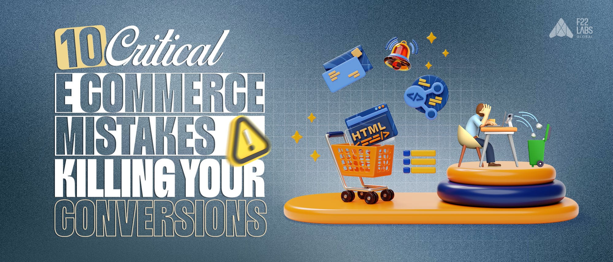
10 Critical Ecommerce Mistakes Killing Your Conversions
E-commerceE-commerce doesn’t fail because of weak products alone. More often, conversions drop because of small, overlooked friction points, slow pages, confusing navigation, hidden fees, or poor mobile experiences.
These issues rarely look dramatic. But together, they silently reduce trust, increase bounce rates, and inflate cart abandonment.
In this guide, I break down 10 high-impact ecommerce mistakes that directly affect conversions, and more importantly, how to fix each one practically without redesigning your entire store.
If your traffic is growing but sales aren’t, this is where to look.
The 10 Critical Ecommerce Mistakes Killing Your Conversions
1. Ignoring Account Login and Guest Checkout Options
Forcing users to create an account before completing a purchase is one of the most common causes of cart abandonment. Every additional step in checkout increases friction and reduces completion rates.
How to Fix It
Enable Guest Checkout:
Allow customers to complete purchases without mandatory registration. Make account creation optional after checkout, not before.
Offer Social Sign-In:
Integrate Google or Facebook login to reduce form friction and auto-fill basic details. This speeds up checkout and lowers drop-off.
Use Progressive Profiling:
Collect only essential information at checkout. Gather additional customer data later through post-purchase emails or loyalty flows.
Reducing friction at checkout directly improves conversion rates by keeping the buying process fast and uninterrupted.
2. Poor Mobile Optimisation and Responsiveness
A large percentage of ecommerce traffic comes from mobile devices. If your store loads slowly, displays poorly, or has difficult-to-click elements, users will leave before exploring your products.
Mobile usability directly impacts bounce rate, session duration, and checkout completion.
How to Fix It
Use Responsive Design Standards:
Ensure layouts automatically adapt to different screen sizes. Modern frameworks and Shopify themes already support responsive design — but they must be configured properly.
Test Across Devices and Browsers:
Review your store monthly on major devices (iPhone, Android) and browsers (Chrome, Safari, Firefox). Tools like BrowserStack help identify rendering or interaction issues before customers encounter them.
Optimize for Speed (<2s Load Time):
Compress images, minify CSS/JS, and remove unnecessary scripts. Use tools like Google Lighthouse to monitor performance regularly.
Improving mobile experience reduces friction and keeps users engaged through checkout.
3. Complex Navigation Structures
Confusing menus increase bounce rates and reduce product discovery. When users cannot quickly understand where to click next, they leave.
Navigation clarity directly impacts session depth and conversion rates.
How to Fix It
Implement Breadcrumb Navigation:
Breadcrumb trails (e.g., Home > Women > Dresses) help users understand their location and backtrack easily, reducing drop-offs on category pages.
Limit Primary Menu Items:
Keep top-level navigation concise (5–7 main categories). Use dropdowns or mega menus for subcategories without overwhelming the user.
Use Behavior Analytics Tools:
Heatmaps (e.g., Hotjar) and session recordings reveal where users hesitate or abandon navigation paths. Review monthly and simplify accordingly.
Clear navigation reduces friction and improves product visibility across your catalog.
Build Lean. Learn Fast.
Launch an MVP that saves money while proving your concept works.
4. Broken or Useless On-Site Search
Many users rely on the search bar instead of browsing categories. If search results are inaccurate, slow, or fail to recognize common terms, users leave quickly.
Search functionality directly impacts product discovery and revenue. When queries return zero results due to missing synonyms or poor indexing, it creates friction and reduces trust.
How to Fix It
Implement AI-Powered Search:
Tools like Algolia or Elasticsearch improve relevance by recognizing synonyms, handling typos, and understanding intent. This ensures that searches like “sneakers” and “trainers” return consistent results.
Enable Autocomplete and Suggestions:
Real-time suggestions reduce search effort and guide users toward relevant products before they finish typing.
Improve Accessibility with Voice Search:
Voice-enabled search supports hands-free interaction and improves usability for mobile and accessibility-focused users.
An optimized search experience reduces bounce rates and increases product visibility across your catalog.
5. Slow Site Speed and Poor Load Time
Google reports that pages taking more than 3 seconds to load can lose over 50% of mobile users. For ecommerce stores, even a one-second delay can reduce conversions significantly.
Slow load times don’t just frustrate users — they affect SEO rankings, increase bounce rates, and reduce overall revenue. Speed is not a technical detail; it is a direct growth lever.
How to Fix It
Use a Content Delivery Network (CDN):
Services like Cloudflare distribute your website across global servers, reducing latency and improving load time for users in different locations.
Minify and Optimize Assets:
Compress images, remove unused CSS/JS, and minify files to reduce payload size. Tools like WP Rocket (WordPress) or Shopify’s built-in optimizations can automate this process.
Run Monthly Performance Audits:
Use Lighthouse or GTmetrix to identify bottlenecks such as render-blocking scripts, oversized images, or server response delays. Treat performance checks as a routine maintenance task.
Improving site speed increases engagement, reduces abandonment, and directly improves conversion rates.
6. Hidden Fees at Checkout
Nearly 48%e-commerce of cart abandonments happen because of unexpected costs at checkout. When shoppers see surprise shipping fees, taxes, or service charges at the final step, trust breaks instantly.
Pricing transparency is not optional in e-commerce. It directly impacts conversion rates and customer lifetime value.
How To Fix It
Show Estimated Costs Early
Display shipping and tax estimates on product pages or in the cart before checkout begins. Shopify and WooCommerce both support real-time rate previews. Early transparency prevents last-step drop-offs.
Introduce a Free Shipping Threshold
Set a clear minimum order value (e.g., “Free shipping on orders above $50”). This not only reduces abandonment but also increases average order value (AOV).
Use Real-Time Dynamic Pricing
Implement dynamic calculators that update shipping, tax, and discounts based on user location and cart contents. Tools like Bold Commerce or WooCommerce Dynamic Pricing eliminate pricing surprises.
Transparent pricing builds trust.
Trust reduces abandonment.
Reduced abandonment increases revenue.
7. Inadequate Product Descriptions
Around 20% of ecommerce returns happen because customers feel the product did not match expectations. In most cases, the issue isn’t the product — it’s unclear or incomplete product information.
When shoppers don’t see sizing clarity, materials, dimensions, real-use visuals, or FAQs, they buy with uncertainty. Uncertainty increases returns. Returns reduce margins.
Clear product pages reduce friction and increase conversion confidence.
How To Fix It
Highlight Benefits in Structured Bullet Points
Replace long paragraphs with scannable benefits:
- Exact dimensions
- Material composition
- Fit guidance (true to size / slim fit)
- Use-case clarity
Structured formatting improves readability and speeds decision-making.
Add Visual Proof (Video, 360°, AR)
Static images are no longer enough. Include:
- Demo videos showing real-world use
- 360° product views
- AR previews (especially for furniture or décor)
Visual validation reduces hesitation and lowers return rates.
Embed Social Proof & On-Page FAQs
93% of shoppers read reviews before purchasing. Verified reviews increase trust, and products with 5+ reviews can see up to a 270% conversion lift (Spiegel Research Center).
Add:
- Verified customer reviews
- Trust badges near CTA
- A short FAQ section addressing sizing, shipping, returns
Build Lean. Learn Fast.
Launch an MVP that saves money while proving your concept works.
Strong product pages don’t just describe, they eliminate doubt.
Clear information reduces returns.
Reduced returns protect profit margins.
Protected margins scale ecommerce sustainably.
8. Lack of Reviews and Trust Signals
A product with 5+ reviews has a 270% higher chance of being purchased. Products with strong positive reviews, especially those rated five stars or higher, build immediate trust with potential buyers.
Shoppers often rely on the experiences of others to validate quality and performance before making a purchase. A high volume of top-rated reviews signals customer satisfaction, which increases confidence and significantly boosts the likelihood of conversion.
How To Fix:
- Showcase Verified Customer Reviews: Reviews are like a friend’s recommendation; shoppers rely on them. Display verified reviews (5+ can boost purchases by 270%, per Spiegel Research Center) prominently on product pages. Use tools like Yotpo or Trustpilot to collect and show authentic feedback, and consider adding a “verified buyer” badge for extra trust.
- Include Trust Badges and SSL Indicators: Trust badges (like “Secure Checkout” or “PayPal Verified”) and the “https://” padlock in your URL are like a storefront’s “Open” sign; they reassure shoppers their data is safe. Add badges near your checkout button and ensure your SSL certificate is active (check with SSL Labs’ Scanner). This screams, “Shop with confidence!”
- Highlight Media Mentions or Partnerships: Been featured in a blog, or magazine, or partnered with a big brand? Flaunt it! Add an “As Seen In” section with logos of media outlets or partners on your homepage or product pages. It’s like name-dropping a celebrity endorsement, making your store feel legit, and boosting shopper confidence.
These steps make your site feel safe and reputable, turning hesitant visitors into loyal customers with ease!
9. Unoptimized Calls-to-Action (CTAs)
Users often click away from a site because a boring “Buy Now” button feels too pushy or vague. Generic calls-to-action (CTAs) like that can slash conversions.
Shoppers respond better to calls to action that are simple, relatable, and inviting. Instead of generic phrases like “Submit” or “Click Here,” effective CTAs use clear language that guides users confidently, such as “Get My Free Sample” or “Start Your Trial.”
How To Fix:
- Use Enticing CTAs Like “Start Your Free Trial” or “Add to Cart – 20% Off Today”: Generic “Buy Now” buttons can feel like a cold sales pitch, cutting conversions by up to 22%. Instead, use warm, specific CTAs that match your product and spark excitement, like “Start Your Free Trial” for a subscription or “Add to Cart - 20% Off Today” for a sale. Add urgency or value to nudge shoppers to act fast.
- Optimise Button Contrast, Spacing, and Placement: Think of your CTA buttons as neon signs; they need to stand out! Use high-contrast colours (e.g., bright orange on a white background), leave enough spacing around buttons to avoid a cluttered look, and place them where eyes naturally go, like above the fold or near product details. Tools like Hotjar can show where users click, helping you perfect placement.
Creating user-friendly forms throughout your checkout process make interactions feel more human and increase the likelihood of action, boosting sales without feeling pushy!
10. Security Lapses and Outdated Plugins
Imagine your e-commerce store as a physical shop with an unlocked back door; that’s what security lapses and outdated plug-ins are like. A single hack can cost you a lot of money, plus the trust of your customers.
Outdated plugins on platforms like Shopify or WordPress can create serious security risks. When developers release updates, they often include patches for known vulnerabilities.
If those updates are ignored, cybercriminals can exploit the gaps to access sensitive customer data or disrupt site performance. Regularly updating plugins is a simple but essential step in protecting your e-commerce store from potential attacks.
How To Fix:
- Run Regular SSL Certificate Audits: Think of your SSL certificate as your site’s “https://” padlock; it keeps customer data safe. Check every 3-6 months to ensure it’s valid and not expiring soon. Tools like SSL Labs’ Scanner can spot issues for free, preventing scary browser warnings that drive shoppers away.
- Enable 2FA and Encryption: Two-factor authentication (2FA) is like adding a deadbolt to your admin accounts; hackers can’t get in with just a password. Turn it on in your platform’s settings. Also, ensure your site uses encryption (like AES-256) for sensitive data, which payment gateways like Stripe often handle automatically.
- Schedule Monthly Plugin/Theme Updates: Outdated plugins or themes are like rusty locks, easy for hackers to pick. Set a monthly reminder to update all plugins, themes, and your platform’s core software (Shopify, WordPress, etc.). Most platforms flag updates, so it’s just a few clicks to stay secure.
These steps keep your store safe, your customers’ trust intact, and costly breaches (potentially over $200,000) at bay. It’s peace of mind for you and your shoppers!
Conclusion
E-commerce success rarely depends on a single big mistake. More often, it’s a series of small, overlooked issues that quietly reduce trust, increase friction, and push customers away.
From forced account creation and slow mobile performance to confusing navigation and hidden fees, each problem chips away at your conversion rate. The good news is that these issues are practical, measurable, and fixable.
By improving user experience, increasing transparency, strengthening trust signals, and optimizing performance, you create a smoother buying journey — and smoother journeys convert better.
In e-commerce, growth doesn’t just come from more traffic. It comes from removing the reasons people hesitate.

Murtuza Kutub
A product development and growth expert, helping founders and startups build and grow their products at lightning speed with a track record of success. Apart from work, I love to Network & Travel.
Next for you

MVP Development
How SaaS Companies Can Align Product Development With Revenue Targets

MVP Development
7 Best Outsourcing Software Companies of 2026

MVP Development
MVP Design & Customer Advocacy: How to Build Products Users Love in 2026