


Cracking The Code Of Form UX: A Guide On Crafting User-friendly Forms

Forms: the unsung heroes of the digital world. They’re everywhere from signing up for a platform to satisfying our late-night pizza cravings but let’s be real filling out a form sometimes feels like navigating through a maze field blindfolded. This blog is your ticket to crack the code of form UX to ensure your forms are user-friendly and effective.
Why is good form UX important?
Remember the last time you encountered a form that made your eyes roll so hard and you left it halfway? Yeah, we’ve all been there.
Let’s see an example of why we should focus on the form UX loud and effective. Let's analyze this beast below.
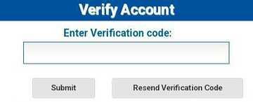
Header clarity: The header “Verify Account” is vague. It doesn’t specify the purpose of verification or what account it pertains to.
Input field labeling: The label “Enter Verification code” is not descriptive enough. It should clarify how the code will be sent(via email/SMS).
Button placement and clarity: The “Submit” button should be the primary button and clearly should reside on the right side with a contrasting color. Let’s ignore the button alignment as we did🫣
Good form UX prioritizes the user's experience by making forms clear, concise, and easy to navigate. This not only improves user satisfaction but also increases conversion rates and data accuracy. Happy users translate to happy businesses, so good form UX is a win-win!
Key elements of good form UX.
- Ideal form length and inputs
Here’s the golden rule: keep your forms concise. Limit your form fields to only the essential information. Studies have shown that the forms that have more input fields have lower conversion rates.
Don’t bore users with a monotonous lineup of input fields, mix and match. For open-ended questions, use text fields whereas for pre-defined choices, offer dropdown. By blending different input types, you are keeping the user more engaged.
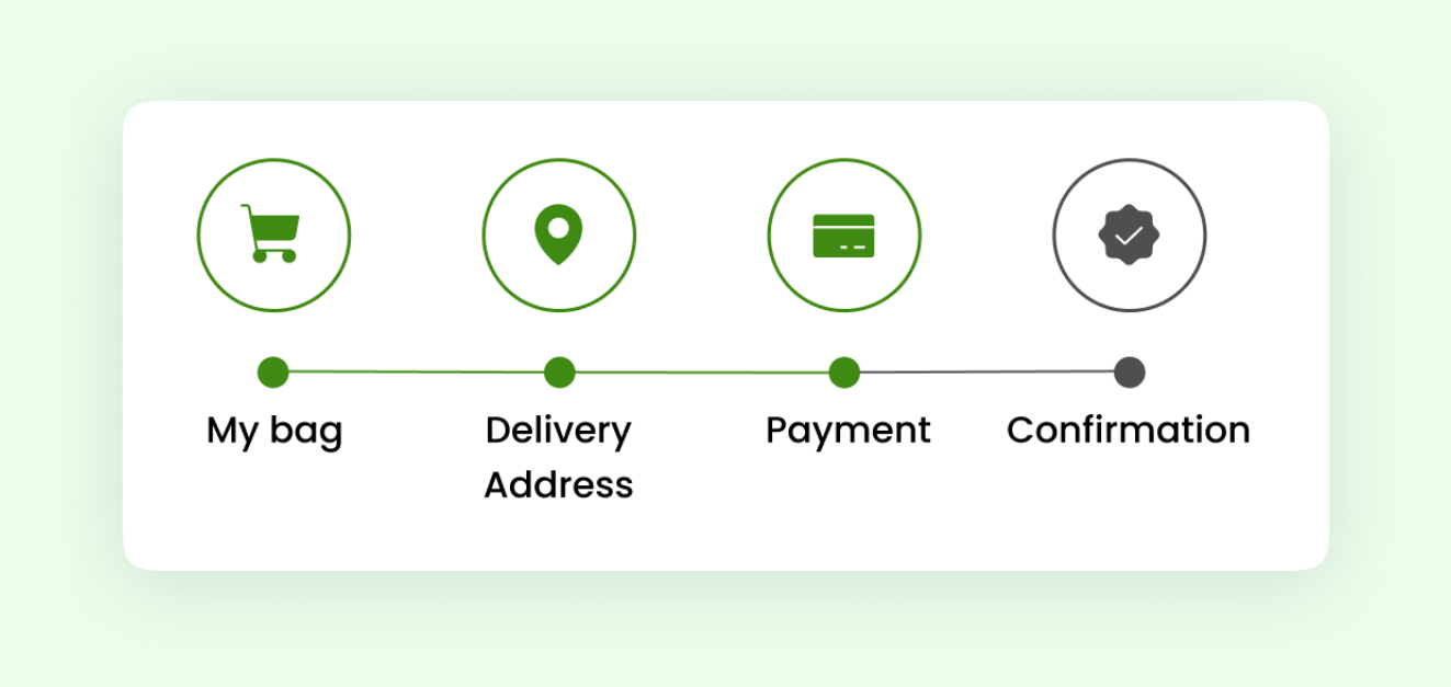
To further enhance user experience, consider breaking down long forms into multi-stage or step forms. This approach not only makes the form less intimidating but also allows the user to focus on one section at a time.
Additionally, incorporating a functionality to auto-save progress at each stage of the form can be a real lifesaver. By this, the user can revisit and complete their form later without losing their input, ultimately enhancing the completion rate.
- Clear labels
Crystal clear labels are crucial. Users should instantly understand what information is needed in each field. In addition to clarity, try to use consistent terminologies across the form labels to reduce confusion. And remember, keep your labels short and sweet to prevent overcrowding and maintain a clean visual appearance.
- Clear instructions
Teaming up with clear labels, concise and clear instructions plays a vital role in enhancing the user experience. A placeholder text within the field can offer subtle hints, guiding users on the expected format or content. Brief instructions via a tooltip can provide additional context without cluttering the form interface.
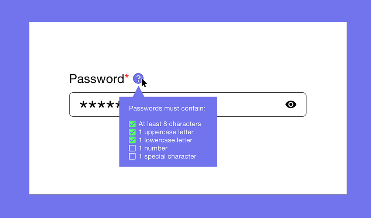
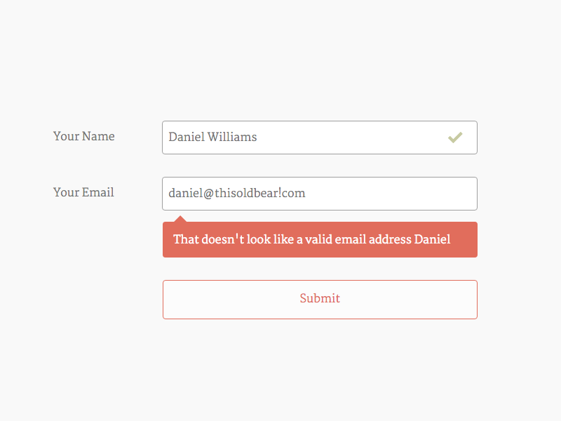
- Inline Validation and error messages
Let's dive into inline validation and error messages - a crucial duo for smooth form interactions. Inline validation acts as a helpful guide, providing real-time feedback as users type in their information, and helping them correct mistakes on the spot. It's like having a virtual assistant nudging you in the right direction.
And when errors inevitably occur, clear and concise error messages step in to save the day. These messages pinpoint the issue with precision and offer guidance on how to resolve it, ensuring users can quickly get back on track. With inline validation and error messages working hand in hand, it enhances the overall user experience.
- Logical flow and order
It's the GPS of form design, guiding users through a seamless journey. Imagine your form is a captivating story; you wouldn't want to start at the end, right? Instead, organize it like a well-crafted narrative, leading users from start to finish in a logical sequence.
Users should have the power to backtrack and edit their responses at any time. With this flexibility, you are turning your strict questionnaire into an engaging journey allowing the users to navigate at their own pace.
Consider incorporating visual cues such as progress indicators or breadcrumbs to help users track their journey and navigate back if needed. With this thoughtful
approach, users can move back and forth through your form with ease, knowing exactly where they are now and where they're headed.
- Auto-fill Functionality
Auto-fill is the silent helper who helps in streamlining the form completion process by automatically populating fields with relevant information. Leveraging browser autofill capabilities or integrating with third-party tools can save users time and effort, especially for repetitive form submissions. This feature not only enhances convenience but also reduces user frustration, ultimately improving conversion rates.
For auto-filling, the code complexity can range from simple data manipulation for basic auto-fill to complex algorithms and secure storage for advanced auto-fill features. Here are the potential code efforts needed for Auto-filling forms:
Front-end: Writing Javascript code to interact with the form elements, access user data, and inject it into the fields.
Security: Implementing measures to protect sensitive data like passwords and credit card information. This can involve encryption and secure storage techniques.
- Proximity Considerations
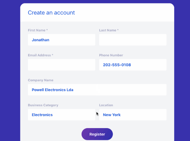
Proximity is not just about throwing the related elements together, it's the art of arranging the form elements like a strategic game of war. When elements are strategically placed in close proximity, users can intuitively grasp their connections and navigate the form with ease. By organizing form elements into logical groupings, you enhance clarity and facilitate a seamless user journey.
Here as in the form below, by grouping the personal and organization’s info separately, users can navigate through the form seamlessly as they can process the information more quickly. This will ensure clarity and minimize errors, thereby improving the experience and engagement.
- Mobile responsive design
In today’s digital world, where everyone is constantly on the move with their smartphones, it is essential to ensure that your forms seamlessly adapt to various screen sizes and orientations, featuring touch-friendly input fields and intuitive navigation. Implementing mobile-friendly design practices not only accommodates a growing mobile user base but also improves overall accessibility and user satisfaction.
Now, let’s see a comparison between a well-designed and poorly-designed form.
In the badly designed form, the fields are all over the place, making it hard to decide to where to fill in your information. The labels are lengthy and not so crisp. Also, the passwords are not masked which is a security issue. Even more, selecting the preferred mode of contact from a dropdown complicates the process.
In the well-designed form, the fields look neat and organized. The labels are short and crisp to the point. The user can seamlessly navigate through the form as it has been structured linearly. The inclusion of radio buttons for selecting the preferred mode of contact increases accessibility and visual clarity allowing the users to quickly scan through and select their choice thereby reducing the errors.

- Button placement
- Left to Right: Our eyes follow this natural path. The primary button should always reside on the right and be bright.
- Prominence (Fitt’s law): The bigger button is the hero; the smaller one, the sidekick. Even the distance from the user’s cursor plays a huge impact.
- Hick’s law: Increased number of choices can overwhelm a user resulting in making the decision time longer. Nothing is worse than losing a customer even though they are interested in your product in the first place. It is like deciding on a Netflix show to watch for dinner. By the time you decide on one, the food is cold.
- Thumb zone: Placing the button that requires frequent interaction should be placed within the natural thumb reach, this will enhance the usability. Does it make sense to keep the salt shaker on the top shelf?
- Flow: Arrange buttons in a logical sequence that follows the user's workflow. For example, in a checkout process, progress from "Add to Cart" to "Proceed to Checkout" should feel intuitive and natural. Which came first: the chicken or the egg? You do the math!
- Color: Choosing the right color for your primary button can be a game-changer in user experience. It's not just a click, it's a color-coded invitation to action that sets the tone for engagement. Selecting the primary button color is like choosing the lead actor for your blockbuster movie—pick the right hue, and your interface will steal the spotlight with every click!
Also consider, how a button will appear in both the enabled and disabled states. For the enabled state, choose a vibrant color to tempt action whereas for the disabled state, opt for a muted or desaturated version of the primary color. This subtle variation can help in understanding the button is inactive without overshadowing the other interactive elements.
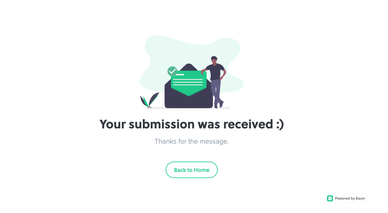
- Feedback / Thank you / Post completion step
Last but not least, a form without feedback is like sending a message in a bottle and never knowing if it reached the shore. So, don't leave your users hanging, ensure your users receive that virtual nod of approval or progress indicator, letting them know their submission has safely reached its destination.
Remember good form is not just about aesthetics, it is about creating a seamless interaction that focuses on easing the pain points of the user. With thoughtful design and attention to detail, businesses can use forms as a powerful tool for engagement and conversion.
Reach out to us to unlock the full potential of your online engagements. Let’s crack the code together to turn your forms into conversion-rate superheroes.
Author Detail
Abirami H
An eager junior project manager who enjoys tackling projects from inception to completion and spotting the tiniest of details but with more coffee breaks.
Let's work together


Next for you

The Role of AI in Software Testing
Quality Assurance Testing
AI in software testing can be used to improve and expedite the testing procedure. Testing with the help of AI assesses a software's functionality, effectiveness, and dependability by automating data validation, error detectio...

The Fusion of AI and Automation Testing: Revolutionizing QA
Quality Assurance Testing
In the field of physics, fusion is a process where the smallest components of atoms are forced to join together, creating a new atom and releasing an immense amount of energy. Similarly, we are combining AI (the new cool gu...

Boost Site Engagement with Dynamic Open Graph Images in Next.js
Technology
In today’s digital landscape, Open Graph (OG) images play a crucial role in enhancing the visibility and appeal of your web content when shared on social media. This blog explores the implementation of dynamic OG images using...