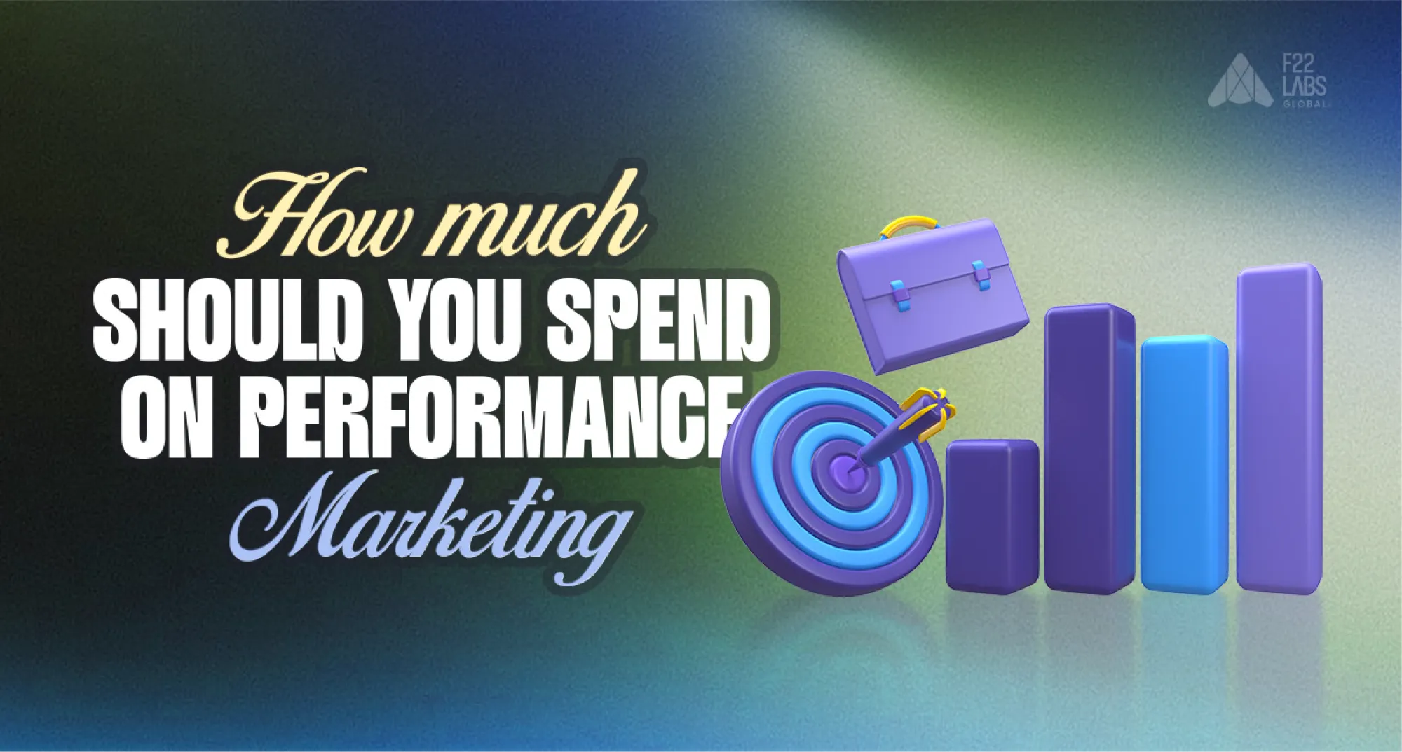
Is your landing page turning visitors into customers or quietly leaking revenue?
I wrote this because most landing pages don’t fail due to traffic; they fail due to friction.
Your landing page is not just a digital storefront; it is a conversion system. When structured correctly, it aligns message clarity, user psychology, and performance optimization into one focused path toward action.
The average landing page conversion rate across industries is around 6.6% as of Q4 2024. That means most pages are underperforming. The difference between average and high-performing pages often comes down to disciplined optimization.
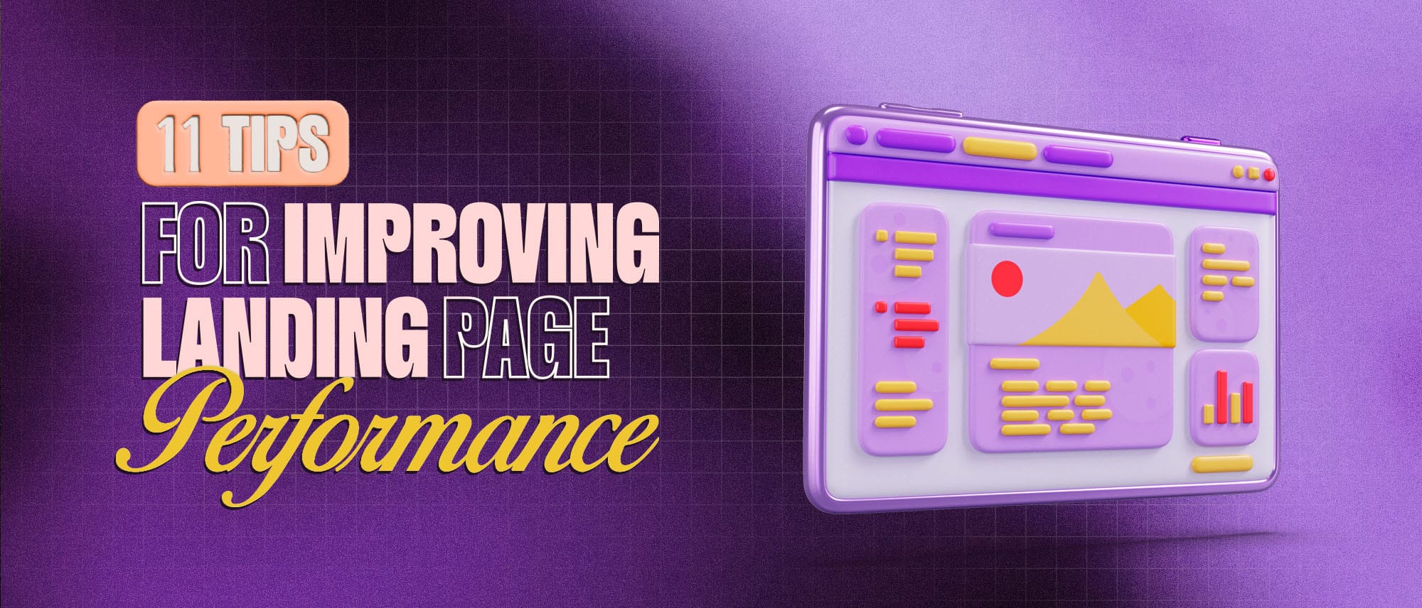
Below are 11 strategic improvements that directly influence conversion behavior and measurable performance outcomes.

1. Craft a Clear and Compelling Headline
Your headline is the first thing visitors see when they land on your page. It serves as the initial hook that either grabs attention or lets potential customers move on.
A strong headline needs to immediately convey the value of what you offer, making it clear why visitors should care.
For example, Dropbox’s headline, "Keep life organized with Dropbox," speaks directly to users' needs and offers a benefit right away.
Here are some of the tools available online to check your heading score CoSchedule Headline Analyzer or EMV Headline Score
This approach works because it directly addresses the problem Dropbox solves: keeping important documents and files organized and accessible.
Avoid vague headlines like "Welcome to Our Site," and instead opt for something benefit-driven. Consider using specific numbers or proven results to make it even more compelling.
2. Optimize for Mobile Users
With mobile traffic accounting for a significant portion of web visitors (nearly 60-70% across various industries), ensuring your landing page is mobile-friendly is more important than ever.
Take Airbnb, for example. Their landing page seamlessly adjusts to mobile devices with fast load times and easy-to-navigate forms, resulting in higher conversion rates across all screen sizes.
If your landing page isn't optimized for mobile users, you'll likely lose a significant portion of potential customers who visit but leave due to a poor user experience. Mobile-friendly elements include larger buttons for easy tap interactions, quick-loading pages, and simple forms designed for smaller screens.
3. Keep Forms Short and Simple
Long, complicated forms can significantly reduce the chances of a visitor completing your desired action, such as signing up for a newsletter or making a purchase. Research by HubSpot found that forms with more than five fields see a dramatic drop in conversion rates.
Ads That Don't Burn Cash
Get a strategy built for ROI—not vanity metrics.
For instance, Uber’s driver sign-up page only asks for a name, email, and phone number upfront, rather than bombarding users with requests for a full address or additional details. This simple, frictionless approach makes it easy for users to get started.
Keeping forms short means only asking for essential information upfront and saving the more detailed questions for later stages in the user journey. Building a truly User friendly form at this stage reduces friction and increases completion rates without overwhelming visitors.
4. Use High-Quality Visuals
Images, videos, and other multimedia elements can greatly enhance user engagement and communicate your product's value more effectively than text alone.
A great example of this is Shopify’s landing page, where they use a short explainer video that visually demonstrates how easy it is to build an online store using their platform. Video content has been proven to boost conversions by 80% or more, as it creates a more immersive and engaging experience.
When selecting visuals, be sure to use high-quality images that complement your message and brand identity. Professional design support or marketing collateral services can also help create persuasive, on-brand visuals that boost engagement and conversions.
5. Implement Strong Calls-to-Action (CTAs)
Your CTA is what drives your user toward conversion. It should stand out, be easy to understand, and convey urgency. For instance, the CTA on the Evernote landing page “Sign Up for Free” is straightforward, actionable, and offers an immediate benefit.
The more direct and compelling your CTA, the higher the likelihood of conversion. Make sure to position the CTA above the fold, use contrasting colors to make it stand out, and use action-oriented text that tells visitors exactly what they’ll gain from clicking.
For example, instead of just saying “Submit,” use something more persuasive like “Get Started Now” or “Claim Your Free Trial.”
6. Leverage Social Proof
People trust other people, especially when they’re considering making a purchase or trying out a new service. Social proof in the form of customer testimonials, reviews, or case studies can significantly increase trust and credibility.
Take a look at the popular online course platform, Teachable. Their landing page prominently displays testimonials from successful creators who have made six-figure incomes using their platform.
This kind of social proof provides validation and reassurance to potential customers, showing them that others have had success with the product. Similarly, case studies or client logos can be used to further establish credibility.
Pro tip: Add a customer photo + name with testimonials to increase authenticity.
7. Ensure Fast Loading Speeds
Page load speed plays a critical role in both user experience and conversion rates. Google’s research shows that 53% of mobile users abandon a site if it takes longer than three seconds to load. A prime example of a company that prioritizes speed is Amazon.
Their landing pages load incredibly quickly, allowing users to browse and shop without delays. Optimizing images, using a content delivery network (CDN), and reducing the number of elements that need to load on a page can help improve load times. The faster your page loads, the less likely users are to abandon it before completing their desired action.
8. Align Content with Ad Copy
When users click on an ad, they expect to see content on the landing page that closely matches the promise made in the ad. This ensures a seamless user experience and reduces bounce rates.
For example, when a user clicks on a Facebook ad for a "30% off all winter coats" sale, they should land on a page that highlights those coats and the discount right away. Any disconnect between the ad copy and landing page can confuse visitors and lead to lost conversions.
Always ensure consistency in messaging, visual style, and the offer presented on both your ads and your landing page. Audit your landing pages monthly for message consistency with current ads.
9. Utilize A/B Testing
A/B testing allows you to test different versions of your landing page to see which one performs better. For instance, Booking.com is known for its continuous use of A/B testing, tweaking elements like the text on their CTAs, the color of buttons, and the placement of social proof to optimize conversions.
Ads That Don't Burn Cash
Get a strategy built for ROI—not vanity metrics.
Even small changes like adjusting the wording of a CTA from “Book Now” to “Reserve Your Spot” or changing the header text can have a significant impact on conversion rates.
Testing and iterating based on data is crucial for ongoing optimization and improving landing page performance over time. Use Google Optimize or VWO, These tools are for readers who are unfamiliar with A/B testing.
10. Minimize Navigation Distractions
When users arrive on your landing page, they must stay focused on the specific action you want them to take, whether that’s signing up, making a purchase, or downloading an ebook.
Companies like Basecamp and Unbounce excel in this area by limiting their navigation options to only what’s necessary. Basecamp, for example, removes any extraneous links that might distract users from the primary goal of signing up for their project management tool.
A clean, minimalistic design with a single path toward conversion can significantly reduce distractions and improve conversion rates.
Pro Tip: Try using a sticky CTA button as users scroll.
11. Incorporate Trust Signals
Trust signals are elements on your landing page that assure visitors that their information and interactions are secure. Examples include SSL certificates, privacy policies, and security badges.
For instance, when you visit a page like that of NordVPN, you’ll immediately see trust signals such as a 30-day money-back guarantee and the presence of secure payment options.
These small but powerful indicators reduce anxiety and build trust with visitors, increasing the likelihood that they’ll convert. Displaying these signals, especially near your CTA, can ease concerns about privacy and security, boosting conversions.
Conclusion
Improving landing page performance rarely requires a full redesign. It requires disciplined prioritization of clarity, speed, trust, and behavioral alignment.
Conversion optimization is not a one-time task; it is an ongoing refinement process driven by user data and measurable outcomes.
When you treat your landing page as a performance asset rather than a static page, incremental improvements compound into significant conversion gains.

Naveen S
3.5 Years of Experience in Digital Marketing. Specialized in Meta and Google Ads for ECommerce Brands